JH Responsive Web Design
offering multiple services for Chinese people living in USA . . .


Because I only had 1 month, I gave 2 days to user research to figure out what should be included in the new website.
I invited co-workers in charge of company's services and brainstormed together. For each service, unnecessary details were left out, only essential questions were written down and grouped into meaningful sections.
Then these outlines served as major basis to choose and organize contents.

Like every project, this project has gone through many iterations, mostly in Brackets - the html/css editor I used.
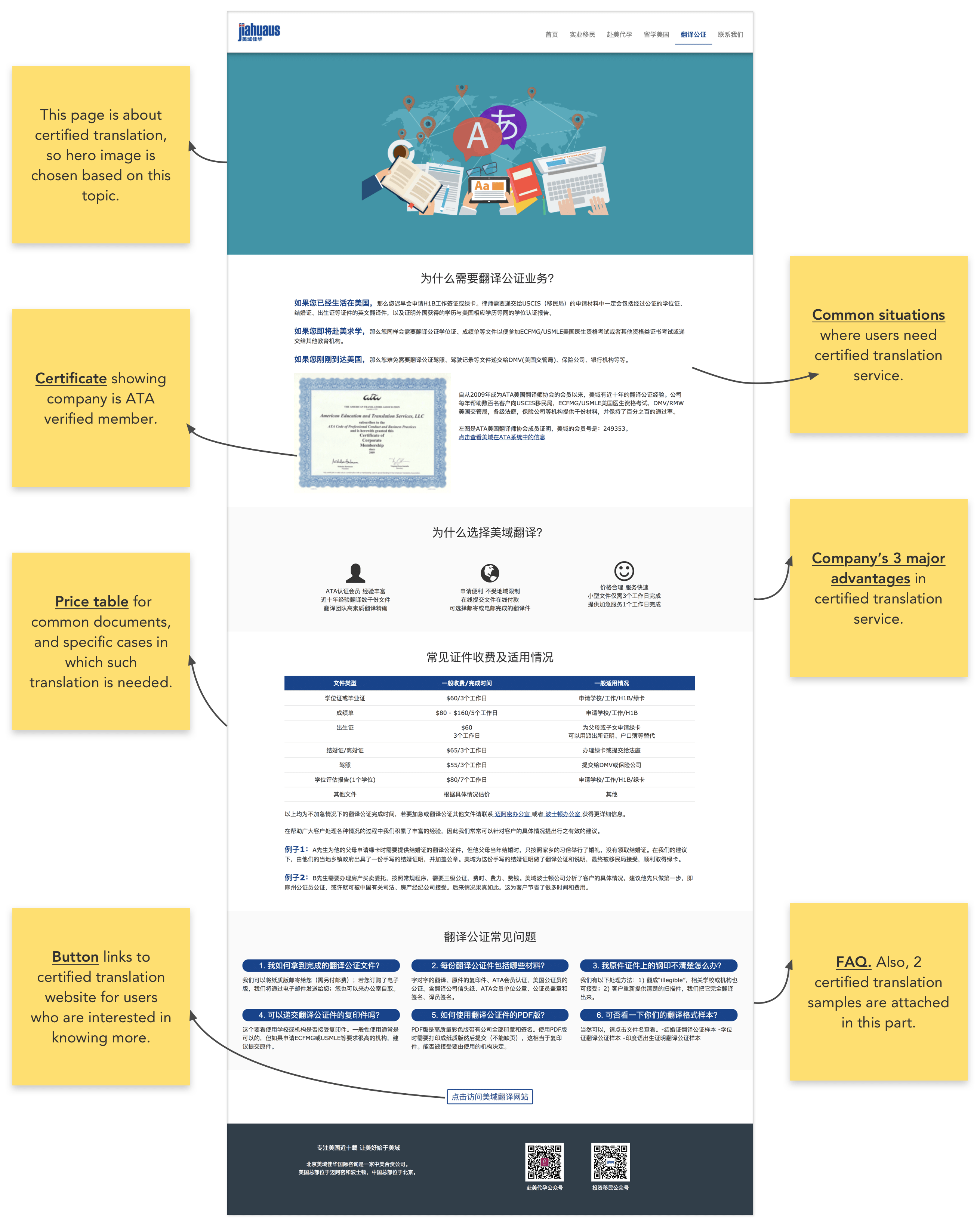
However, I forgot to take screenshots during the coding and prototyping process, so I show the final design directly below.


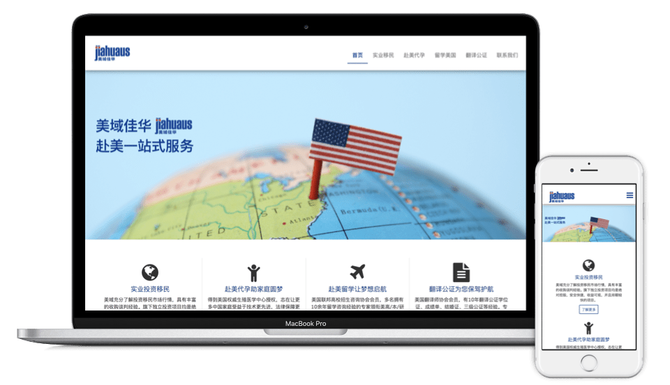
Initially, my managers actually did not expect this website to be mobile responsive. However, I thought this should be mobile responsive because the marketing team would post articles on WeChat (a mobile App). That means there would be mobile visitors, and if the website is not mobile responsive, then we may be losing potential business.
Therefore, I proposed this idea and after I finished building desktop website, I started to work on making it mobile responsive.
Honestly, making it mobile responsive was not easy and there were many unexpetced difficulties along the way. However I overcame these and eventually made it happen.