Jo MVP Design
a more positive life awaits you


This is a 9-month long project. In first 2 months, we built Jo's 1st MVP. Then we conducted a pilot user study to help us launch Jo's 2nd MVP, which we tested again in our 2nd user study.
Everybody wants to live a more positive life. In this era, how technology can help?
What if there is an App, which can: help us better understand our experiences; show us what and who make our life more positive; remind us to do things which will make our life positive?
Powered by Natural Language Processing, Jo is such an App.
First, users enter their experiences in Jo, then Jo understands and decides if these are positive experiences. If yes, Jo then finds activity, people mentioned in these moments to help users better understand their positive experiences.
As users enter more moments in Jo, Jo shows its insights, such as most mentioned people in positive moments, most mentioned activities in positive moments.
Most importantly, by helping users create reminders, Jo encourages users to take actions in their life.
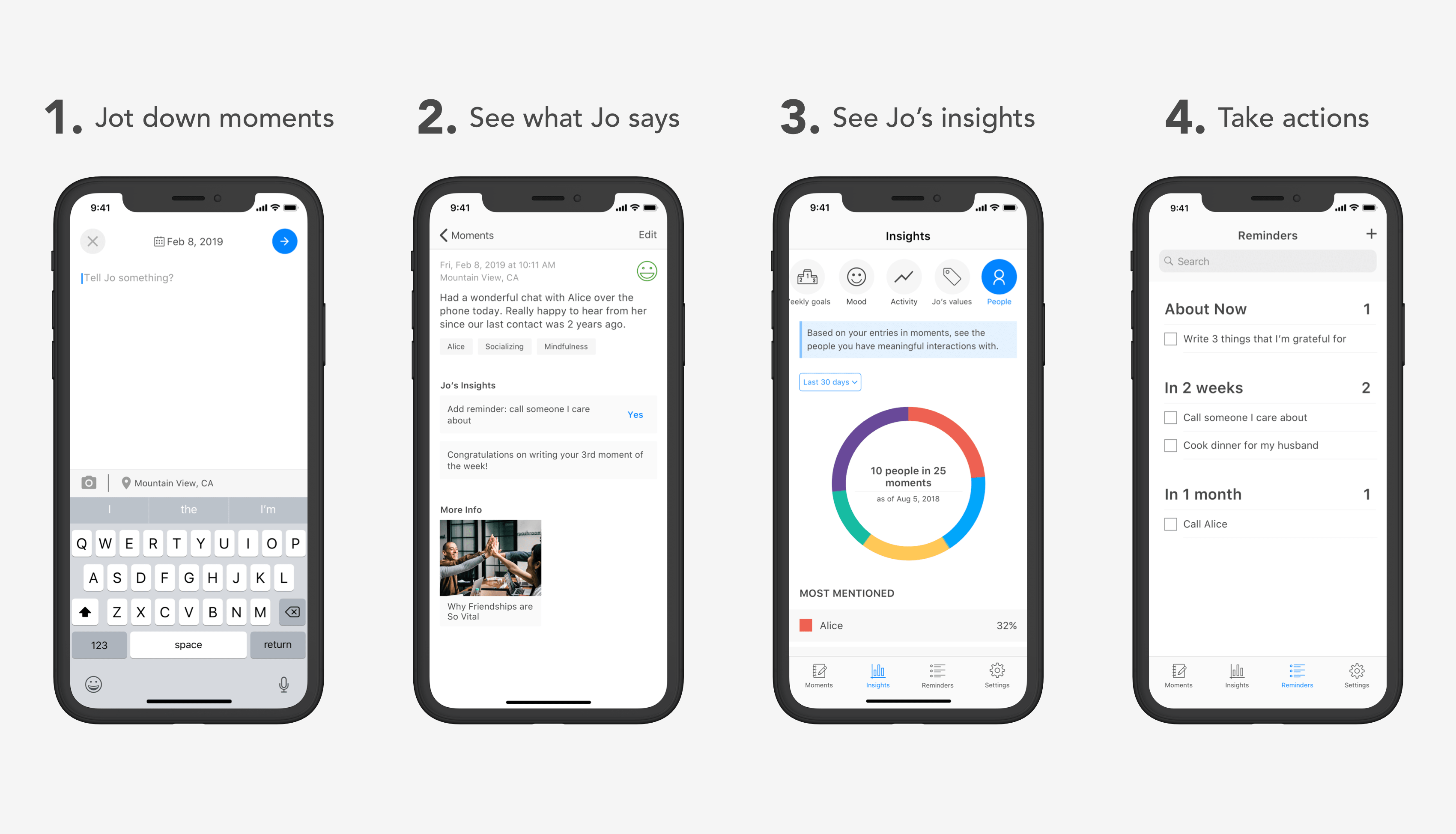
To test the concept of Jo, we need to build the 1st MVP and test in pilot user study.
We only had 2 months to build the 1st MVP, therefore I could not explore all possible design options before making decisions like I'd normally do in other projects.
To ensure we can finish the 1st MVP, I took a different approach: in most parts in my design, I'd use default iOS components, and for important screens/functions, if default ones won't work, then developers will code from scratch.
After deciding on the design approach, I started from paper sketches. I frequently asked PM and developers for feedback and made changes, until finally I got more structured and refined sketches that I could work on my computer.
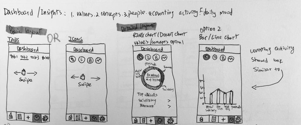
Throughout wireframe-making process, I checked in with developers often to know their opinions from technical perspective and adjusted design accordingly.
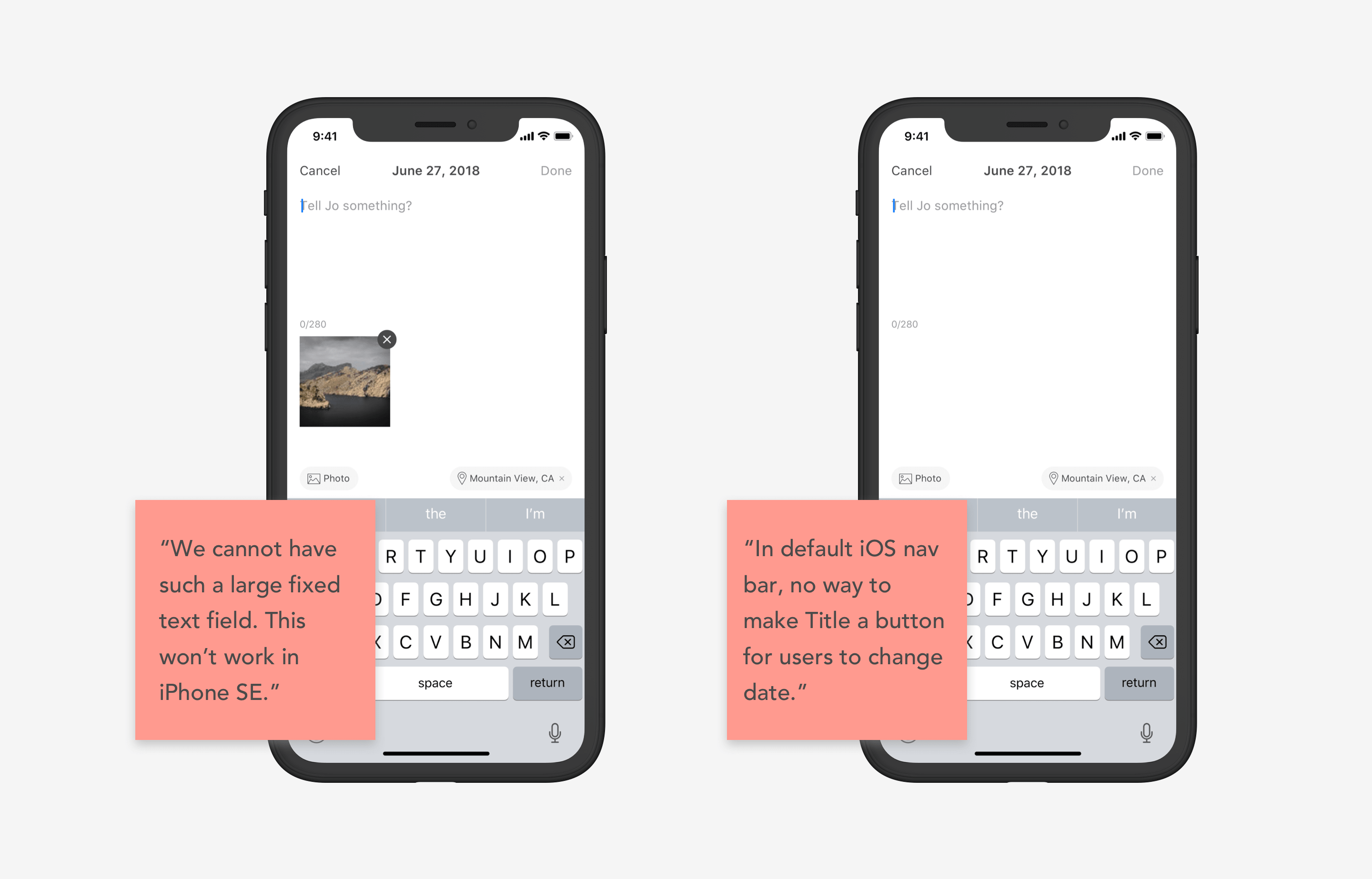
I'll use the screen for users to add new moments as an example. Below is the very first version, I showed it to developers, and learned my first lessons.
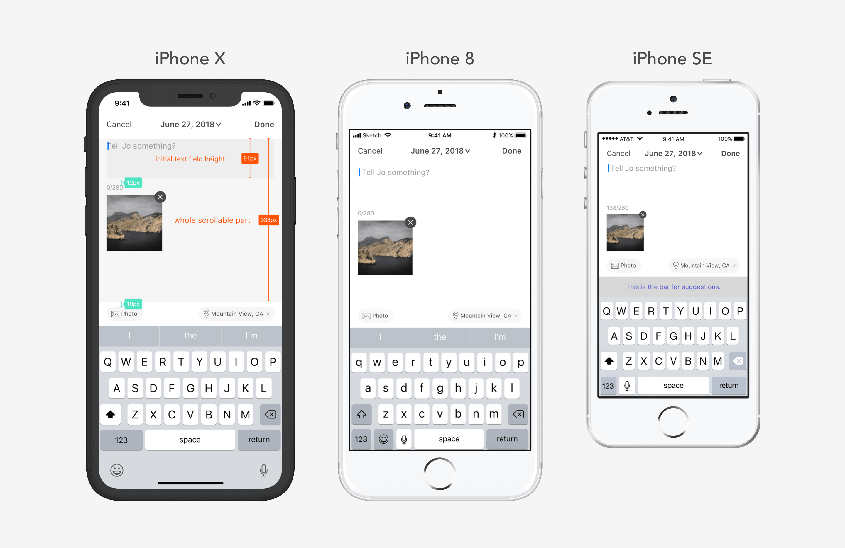
Based on further discussion, we decided to make a customized navbar only for this screen, so that users can tap to change date of their moments. And I found a way to make this screen work on all iPhone devices.
After I've finished 1st round of wireframes, I did 2 usability testing to find if my design has any usability issues.
Following picture shows 1 major usability issue I found.
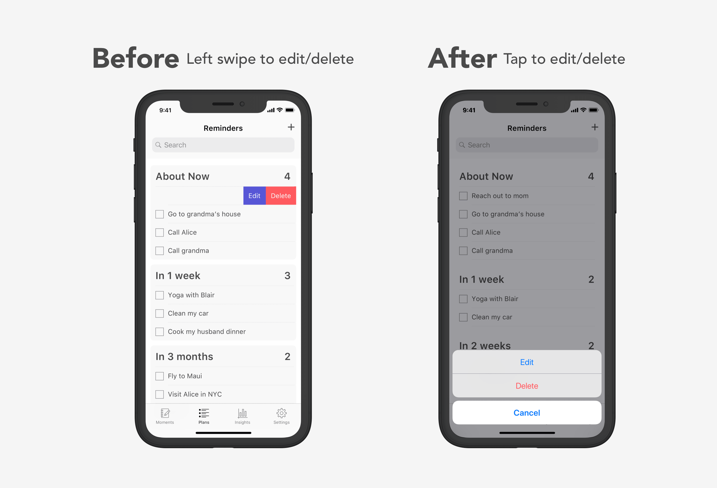
In my original design, edit/delete a Reminder would be triggered by swiping to left, a popular gesture in iOS. However, it is not known to every iPhone user. In one usability testing, the user had no idea swiping to left would trigger more actions.
This made me change: compared to swiping to left, tapping is more intuitive and known to every iPhone user. And later I pushed developers to implement this change.
Initially, Jo was described as: a smart journal that assists mindfulness, which needs to be revisited. A more strong use case should be demonstrated.
After thorough research about existing well-being products in App store, we had the new value proposition which is very straightforward: using Jo leads to a more positive life.
Then I structured onboarding screens based on 3 core features in Jo.

Our team successfully launched Jo's 1st MVP and 21 college students started using Jo in class in 09/2018. Based on user study results, we launched 2nd MVP later.
Overall, users do find Jo valuable in helping them better understand their moments. So, the concept of Jo is validated.
One user quote I remember: "After I write my moment about finishing my math test. Jo finds accomplishment tag for this moment. This makes me rethink of things happening in my life coz I never thought things so small can be called accomplishment. But you know, of course these are accomplishments, though not big. So I feel even happier about this accomplishment."
Following sections are specific usability/design feedback from students.
To our surprise, we foud out that for some users, the #1 roadblock for using Jo is that they do not know what to write down in Jo. We have discussed about potential issues users may encounter, however none of us thought about maybe people do not know what to say.
Following picture shows other feedback as well:
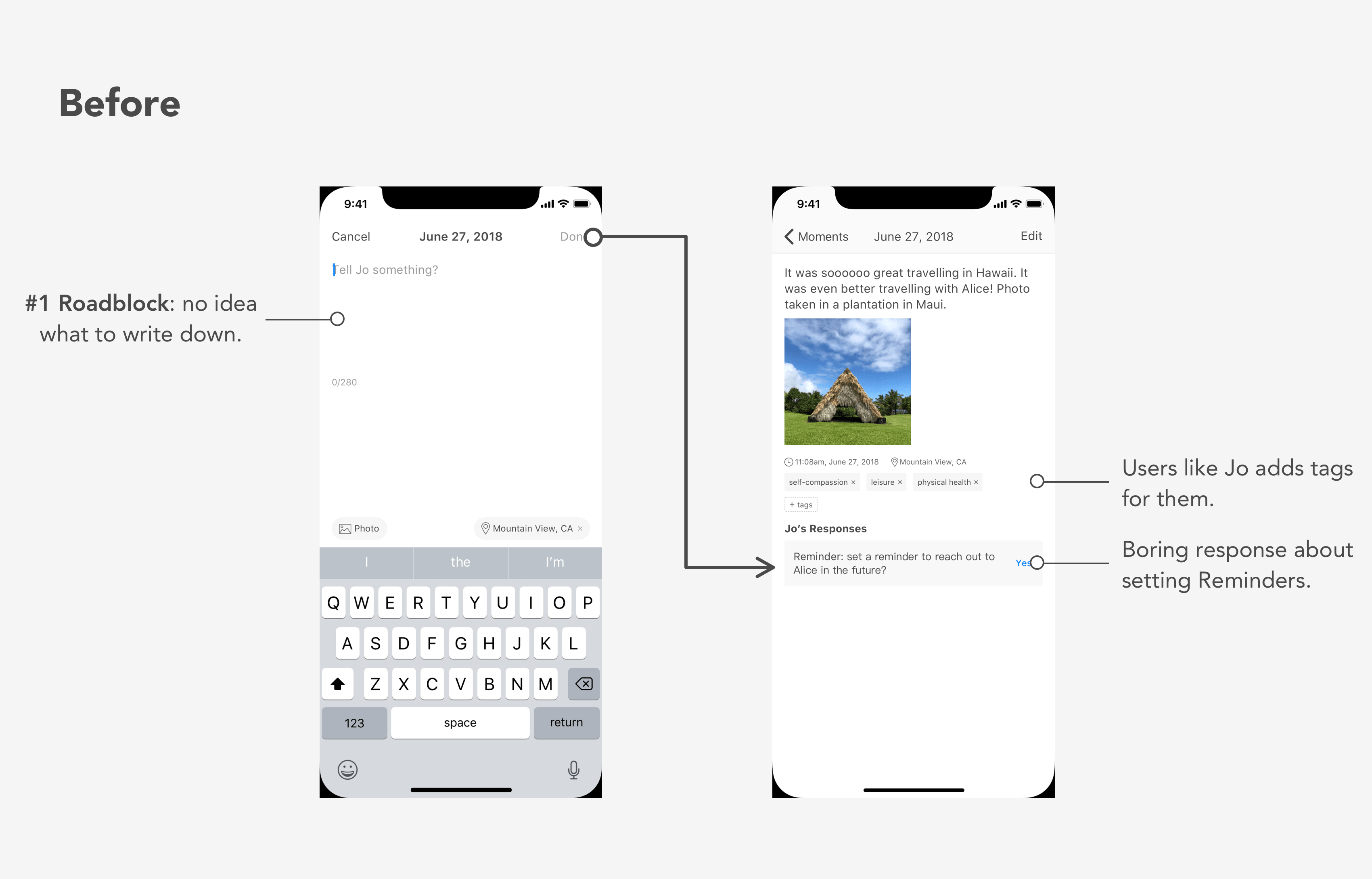
In Jo's 2nd MVP, to address the #1 roadblock, we've added Jo's prompt to offer a topic for people who do not know what to say. Plus, we have added more features/functions that we did not have time to implement in 1st MVP.
Following picture shows updated design:

Following picture shows implemented Insights in 1st MVP, and it was well received by users. Users do find these helpful in understanding their moments.

However, I had an alternative design option: the dashboard idea. I believed this to be better because in this design, less uses' cognitive work is required. So I tested this idea in this user study to gather users' feedback.

Indeed, the Dashboard idea received 100% positive feedback so I later refined this solution. But due to limited time (we must launch 2nd MVP by 01/2019), this new design was NOT implemented in Jo's 2nd MVP.
Though we have very good intentions for including Reminders in Jo, reality is very few users use it. We knew it from back-end data and we dug deeper in user interviews.
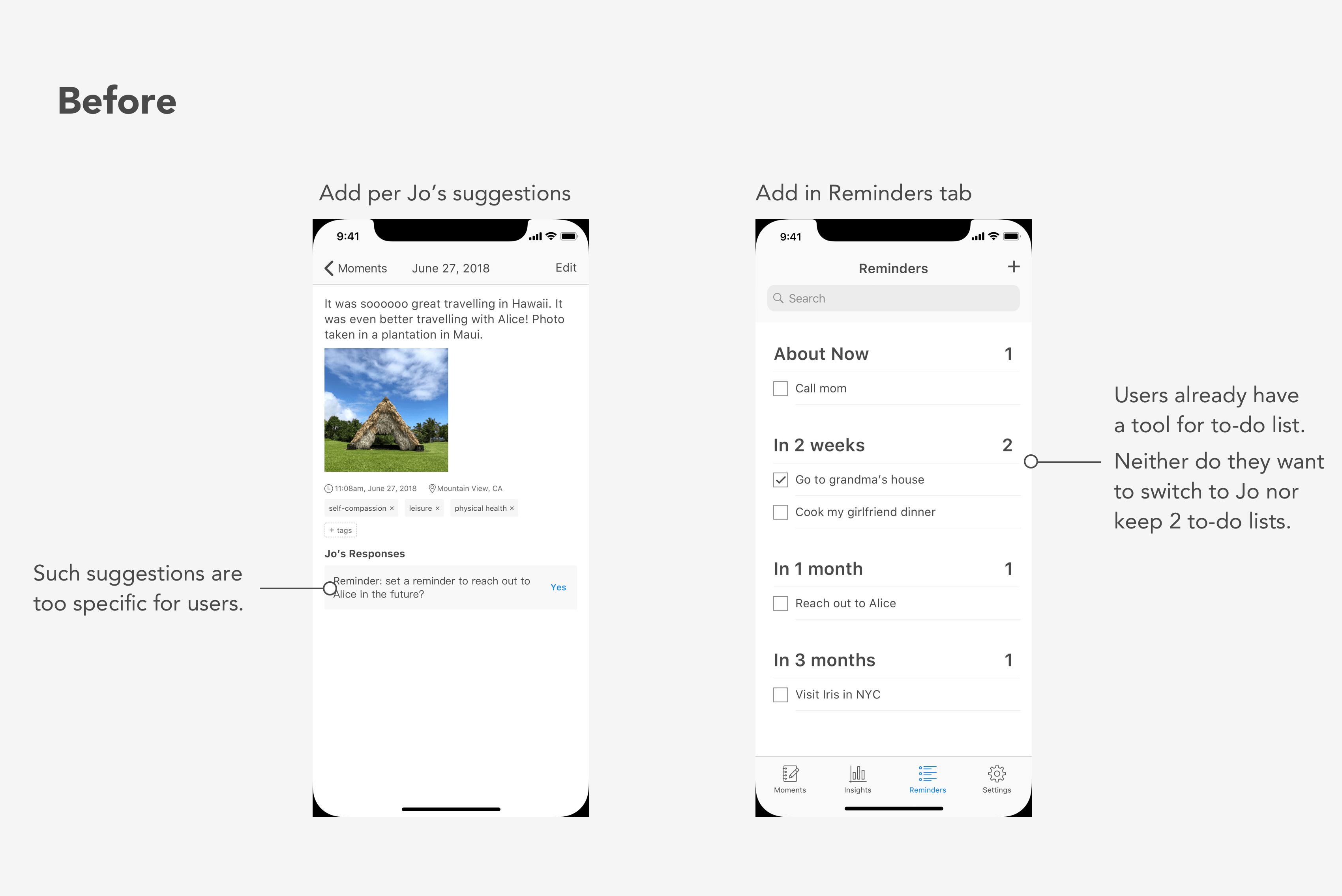
To further test this feature, in Jo's 2nd MVP, we changed back-end algorithm. Instead of giving specific suggestions (eg. reach out to Alice), Jo would give broad ones (eg. call someone I care about).
Jo's 2nd MVP was launched in 01/2019 and used by another 50+ college students. We conducted our 2nd user study in 02/2019.

#1 complaint is about Jo inaccurately tags people and activity in moments. Users feel especially frustrated because they cannot edit People and Activity tags. We knew they would feel frustrated by this but this function was simply not among top priorities due to our limited resources.
In Jo's 2nd MVP, Jo offers 2 more data charts (Activity and People) in Insights. However, users were not very happy about it.

Again, this is due to Jo's low accuracy recognizing Activity and People in users' moments. For example, when users typed in "I ran with Lynn" and "I had dinner with lynn", they meant the same Lynn. But Jo does not know "lynn" is "Lynn" and counts these as 2 different people.
What's more, we did not allow users to edit these inaccurate tags. This makes People and Activity data charts become inaccurate too, leading some users to dismiss Insights altogether.
Though we changed reminders suggestions from specific ones to broad ones in this new version, still, very few users use Reminders in Jo.
Unfortunately in 03/2019, the company decided to discontinue Jo. If we can have a chance to work more on Jo, we'll focus on the following aspects:
The concept of Jo is well received by users. However, frankly speaking, they do not find Jo very useful and valuable to them because Jo is not smart enough in MVP.
All users expect Jo to recognize values/people/activty more accurately, and give more personalized responses. To achieve these, Jo's NLP algorithm must be better.
Users get bored easily. Here are some possible ways to sustain users' interest after their initial novelty wears off:
In 03/2019, we wrapped up user study and finished writing up a paper for technology conferences. No future design and development work will be done for Jo.
Jo has been an amazing project for me. The idea of Jo is very innovative and ambitious. I've worked with really talented and nice people, and I'm happy to say that I've learned and grown so much as a Product Designer by working on Jo.